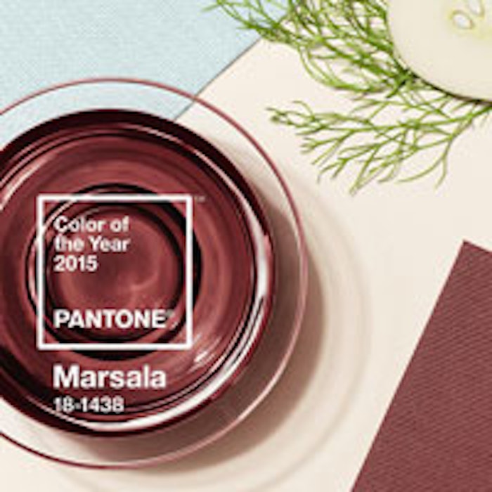
Pantone, an X-Rite company and the global color authority, today announced PANTONE 18-1438 Marsala, a naturally robust and earthy wine red, as the Color of the Year for 2015.
"While PANTONE 18-3224 Radiant Orchid, the captivating 2014 color of the year, encouraged creativity and innovation, Marsala enriches our mind, body and soul, exuding confidence and stability," said Leatrice Eiseman, executive director of the Pantone Color Institute.
"Much like the fortified wine that gives Marsala its name, this tasteful hue embodies the satisfying richness of a fulfilling meal, while its grounding red-brown roots emanate a sophisticated, natural earthiness. This hearty, yet stylish tone is universally appealing and translates easily to fashion, beauty, industrial design, home furnishings and interiors."
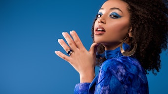
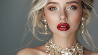
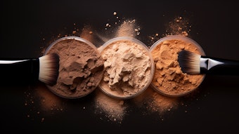
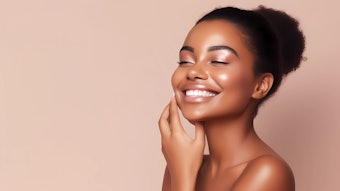
Marsala for beauty
An incredibly versatile color for beauty, Marsala is an appealing and sophisticated shade that's flattering against many skin tones.
Marsala pairs exquisitely with monochromatic mixes of peachy pinks, and sparkles against antiqued gold metallics, offering an assortment of lipstick and blush options. Marsala illuminates a range of smoky-neutral color combinations, making it a captivating eye shadow color that can be worn from morning until night. Add an overlay of bronze for a dramatic look that suits any eye color, or use Marsala as a go-to finishing touch on nails.
Marsala for graphic design
A rich contrasting color, Marsala is ideal for use in graphic design and packaging. Eye-catching, but not overwhelming or bright, consumers are immediately drawn to the hue, making it an alluring shade at point-of-purchase. As packaging becomes increasingly more artistic, Marsala will be a natural fit for both high- and low-tech materials, including on-shelf periodicals as well as printed assets, like calendars and stationery.
Cross-referencing to other PANTONE libraries
PANTONE 18-1438 Marsala can also be cross-referenced to all other PANTONE Libraries, including PANTONE PLUS for graphic design. For cross-referencing information, see www.pantone.com/coloroftheyear.
About the PANTONE Color of the Year
The Color of the Year selection requires careful consideration and, to arrive at the selection, Pantone combs the world looking for color influences. This can include the fashion and entertainment industries—including films that are in production, the world of art, popular travel destinations and other socio-economic conditions. Influences may also stem from technology, the availability of new textures and effects that impact color, and even upcoming sports events that capture worldwide attention.
For 15 years, Pantone's Color of the Year has influenced product development and purchasing decisions in multiple industries, including fashion, home and industrial design, as well as product packaging and graphic design. Past colors include:
- PANTONE 18-3224 Radiant Orchid (2014)
- PANTONE 17-5641 Emerald (2013)
- PANTONE 17-1463 Tangerine Tango (2012)
- PANTONE 18-2120 Honeysuckle (2011)
- PANTONE 15-5519 Turquoise (2010)
- PANTONE 14-0848 Mimosa (2009)
- PANTONE 18-3943 Blue Iris (2008)
- PANTONE 19-1557 Chili Pepper (2007)
- PANTONE 13-1106 Sand Dollar (2006)
- PANTONE 15-5217 Blue Turquoise (2005)
- PANTONE 17-1456 Tigerlily (2004)
- PANTONE 14-4811 Aqua Sky (2003)
- PANTONE 19-1664 True Red (2002)
- PANTONE 17-2031 Fuchsia Rose (2001)
- PANTONE 15-4020 Cerulean (2000)
For the latest news, trends, information and conversations, connect with Pantone on Facebook, Twitter, Pinterest, Instagram and the Pantone Blog.