In today’s crowded marketplace, it is extremely difficult for a cosmetic product to stand out among the many others on the shelf. The current rise in popularity of natural products makes today the perfect time to introduce a whole new experience to beauty product packaging. It is imperative that companies place emphasis on packaging for subtle yet strong brand execution, and in so doing, communicate a contemporary philosophy while ensuring their distinct place in the natural cosmetics market.
Getting back to what is natural is not just a short-term trend; it has a promising and profitable future in the cosmetics business, to which many companies have already caught on. However, with the recent influx of organic and natural cosmetic lines, it is tiring for the customer to visually differentiate between the natural cosmetic brands and their generic counterparts. Differentiating between various levels of quality within the natural sector is yet another challenge.
Research shows that approximately 70% of consumers’ product-buying decisions are based on presentation. So how does a product grab the consumer’s attention? To say it simply—it is the packaging, with all of its subtle cues and subliminal communication, that makes the customer notice a product on the shelf, pick it up, take it to the register and swipe her credit card. It can be asserted, without eqivocation, that the lifestyle, tastes and purchasing psychology of today’s consumers have changed vastly in the past 25 years. As that is the case, why then does much of the cosmetic industry turn to the same outdated packaging design that has ruled the marketplace over the past two decades? Products in the natural arena have changed yet the packaging hasn’t—it is like draping a drab old cover over a swanky new couch.
Kudos to Exceptions
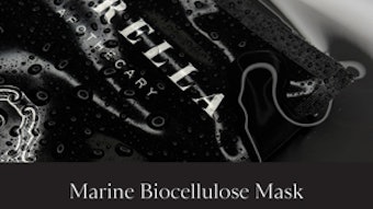
Jurlique just launched new packaging that reflects its vision of purity, integrity and care. The greatness of the previous packaging was in the consistency of dark blue type across the product line, applied mostly on white tinted glass containers and tubes. Each product had a unique appearance that echoed the history of the company’s family-owned herb farm and business in South Australia. The new brand design has a coherent look with its beautifully shaped new containers; on the other hand, the graphics are not that different from other generic cosmetic lines.
Packaging design for most cosmetic brands is in dire need of a makeover. But to find a different path, we must first look at the patterns that have been repeated consistently over the years. Imagine the packaging of a cosmetic product. The picture that most typically comes to mind is a bottle or a jar with centered serif or non-serif type describing its contents. Often the label features a small icon above the font to add a visual kick to the presentation. Sadly, this simple yet unimaginative design still sets the norm for most premium brands in the cosmetic industry.
A major shift is needed in the area of organic and natural products especially. For this segment, the concept of health-conscious products has made critical advances but the packaging hasn’t. Most natural products are still sold in containers that are pure waste. Consumers seeking organic and natural products look for brands that speak to their lifestyle approach. In order to engage and keep these consumers, the packaging of such products must also appeal to this contemporary mindset.
First and most important, the packaging of natural cosmetics should be biodegradable. With the right materials having been used in its creation, the packaging should make this fact very clear by using alternative visual cues to raise itself above the norm. Some brands have attempted to distinguish themselves through label design; however, the result often appears overly crafted and regressive, weak and cheap, or simply plain. Assuming that the natural product is of a high-level, sophisticated quality, why is there so little innovation and fresh approach when it comes to presenting it on the store shelves?
Consumers of health-conscious, natural, organic and sustainable products comprise a progressive group that is not afraid to try new things. When branding products for such consumers, be daringly sophisticated, innovative and different. As the number of products targeting this audience grows, it is vital to sustain their interest on a sociological and aesthetic level. The modern consumer is asking for products that show true improvement on the status quo and wants to do business with companies that communicate honestly, passionately and with authenticity. These natural products must present a healthy alternative to everyday living and stand out from generic skin care, both in the content of the product and in the packaging design.
The branding of natural cosmetics and skin care needs to be fresh and lively. These products should carry a message that conveys a certain luxury, special pampering, or that sweet skin pleasure not provided by a generic product. This message must be aligned with the company’s unique philosophy of contemporary elegance and the enhanced quality that natural ingredients bring to the product. A successful example of such a natural product line is Korres, of Athens, Greece, with its roots in homeopathic pharmacy. This inventive line has an engrossing and contemporary look that is mirrored both in the packaging of its products and the interior design of its stores worldwide. The combination of partially vertical type and pleasing product shots effectively communicates the pure ingredients used to manufacture the products. In this way, the packaging reflects the authenticity and honesty needed to attract new customers.
To continue reading this article, please click here. You will be redirected to GCI magazine's Web site.