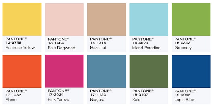
PANTONE has release their annual Fashion Color Report for spring 2017. The 10 hues in focus are just what one would expect from colors that are often associated with spring fashion: bright and indicative of the flora that make their debut during this time of year. Some old favorites, such as pale pinks, will have to compete with the bold, earthy green newcomers. Use these color suggestions for makeup, menu design or perhaps for revamping your spa space. Here is a quick round-up of Pantone’s top 10 colors for spring 2017.
1. Pantone 17-4123 Niagra
This blue is evocative of denim and is predicted to be the most popular color of spring 2017.
2. Pantone 13-0755 Primrose Yellow
This is not your typical spring pastel yellow. It has an underlying warmth to it that will complement the warm, sunny days.
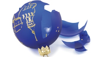
3. Pantone 19-4045 Lapis Blue
This blue is not quite a royal blue not quite a cerulean. It makes its home right in the middle and will make quite the statement come springtime.
4. Pantone 17-1462 Flame
Flame is perhaps the boldest color in Pantone’s list. This reddish orange will no doubt add pops of color to accessories, nails and a bold lip.
5. Pantone 14-4620 Island Paradise
While aqua shades are no stranger to spring fashion, this particular variety is on the borderline of robin’s egg blue. Island Paradise continues the powdery pastel trend that was popular this past spring.
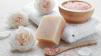
6. Pantone 13-1404 Pale Dogwood
Keeping with the powdery pastels, this shade is the pink version. This color is delicate, lady like and discreet.
7. Pantone 15-0343 Greenery
This homage to spring foliage is a deep yellow- green. This color is almost juvenile and will add fun, exciting pops of color in spring 2017.
8. Pantone 18-0107 Pink Yarrow
This bold and vibrant pink is similar to fuchsia and will undoubtedly be a popular choice for daring nail and lip colors in the spring.
9. Pantone 18-0107 Kale
Yet another green inspired by Mother Nature. Kale is similar to an olive green but with a cooler blue undertone.
10. Pantone 14-1315 Hazelnut
Hazelnut acts as the key neutral in the list. It is almost a pale, dusty mauve that will be key in transitioning from season to season.
For more information visit: pantone.com
