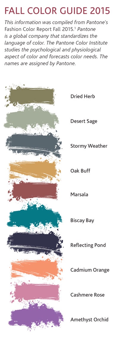
The colors of Fall 2015, as selected by the Pantone Color Institute, cater towards the melting pot of ethnicities and identities that is the modern American. Rather than focusing on the spring 2015 neutral tones, fall has incorporated more vibrant hues to catch attention in both beauty and fashion. Unlike previous seasons, however, fall 2015’s colors are all androgynous, allowing for capitalization by both men and women. “The Fall 2015 palette is rooted in multi-faceted, androgynous colors that can be worn to portray effortless sophistication across men’s and women’s fashion; it is the first time we are seeing a truly unisex color palette,” commented Leatrice Eiseman, executive director of the Pantone Color Institute.1 There were ten hues highlighted for fall 2015, including: Dried Herb, Dessert Sage, Oak Buff, Stormy Weather, Biscay Bay, Reflecting Pond, Marsala, Cadmium Orange, Cashmere Rose and Amethyst Orchid (see Fall 2015 Pantone Colors).
These are described below, broken up by color family, and accompanied with inspiration into menu creation, makeup and spa design.
The Neutrals
Neutrals must be in play in any season to create the contrast that distinguishes the bold. In fall 2015, expect earthy neutrals that play upon the colors of nature—green, nude and grey. Although these neutrals range from cool to warm, they convey a sense of calm.
Dried Herb. This subdued olive green conveys images of earthy sophistication.
Desert Sage. Pantone identified Desert Sage as its ideal neutral for fall 2015. It is a cool, greenish-gray that can certainly be paired with any of the other fall colors.
Oak Buff. Although Oak Buff is described by Pantone as a golden-yellow, this tone appears a camel color, serving as a versatile neutral with most colors.
The Blues
Tranquility and peace are two words at the epicenter of the spa industry that are also major players in this fall’s incorporation of blue. There are three blue shades in this fall’s lineup—a teal, a blue-gray and a deep, almost navy blue—all conveying the feeling of relaxation.
Stormy Weather. This color was named due to its evocation of a dark, overcast day. This medium blue incorporates a gray undertone to allow it to almost serve as a neutral.
Biscay Bay. Teal is back in a big way with this color, which combines the green and blue reminiscent of tropical waters.
Reflecting Pond. Though not a true navy blue, this deep blue has a subtle gray tone to make it a peaceful, reflective color.
The Bolds
Where would fashion or beauty be without bold color? If neutral colors were a birthday cake, bold colors certainly would be the icing. This fall, expect the deep, wine-toned Marsala to stay in fashion, while purple, pink and orange tones make their way onto the palette.
Marsala. It should not be a surprise that Marsala has made its way into this list, as the 2015 Pantone Color of the Year. This red-brown is a rich, robust color reminiscent of wine.
Cadmium Orange. This peachy, orange is warm, yet subtle.
Cashmere Rose. This soft pink incorporates a violet tone, standing out from the typical light pink shade.
Amethyst Orchid. Remember Radiant Orchid, the 2014 Pantone Color of the Year? Its cousin, Amethyst Orchid, isn’t too far off, although it takes on more violet tones than pink tones.
Makeup
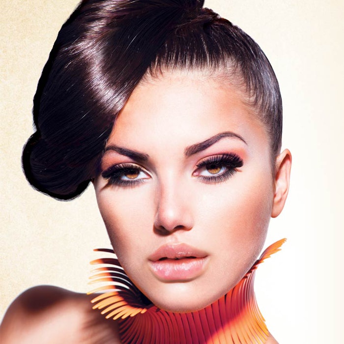
Color trends always have a profound impact on makeup, and fall 2015 will see the incorporation of some of the colors above into innovative palettes for both edgy and classic makeup artists alike. Fall 2015 will see the return of the flushed cheek, which can be produced using the Cashmere Rose and Cadmium Orange shades depending on skin tone.
Cadmium Orange also has application on the eyes in fall 2015, as shades of orange will be prominent there this season. Look for a variety of orange shades on the eyes, from apricot to coral, bringing a little sun into makeup as the weather turns cold.
Also returning in fall 2015 is the berry lip, where Marsala is integral in creating that just-bitten look.
Menu Creation
Fall color trends can be utilized by the spa owner and manager not only when designing the look of a spa menu, but also when deciding what services to offer. When designing the look of the menu itself, why not incorporate some of the colors above and be creative with mixing and matching them.
One of my favorite fashion designers Rebecca Minkoff, combined Oak Buff with Stormy Weather and Marsala in her fall designs, which were inspired by Patti Smith’s androgynous rock style. Don’t be afraid to choose new colors, but pick colors that speak to the brand and the treatments provided. For example, if a spa focuses on natural, organic treatments and ingredients, they may want to choose a few of the neutrals and perhaps add in a blue. If a spa identifies with more of a medical theme, a cool blue and a neutral may be up their alley.
For those that offer traditional spa menus, but want to redesign their menu, why not choose a few neutrals and pop them with one of the bold tones. Blue returning in such a big way to the color palette is beneficial for the spa industry in so many ways. Blues can be used in menu designs from medical spa to organic/natural spa, just be sure to choose the right one.
Colors can also be chosen for seasonal treatment menus. For example, Cadmium Orange, Marsala, Oak Buff and Dried Herb are all autumnal colors that can convey seasonal treatments popular in the fall such as a pumpkin enzyme peel, a cranberry facial, a pomegranate pedicure and an apple cider sugar body scrub.
Although the color palette for the spa menu is typically chosen after the treatments are determined, it can certainly be done the other way around. Multiple blues can be used to highlight a hydrating facial or aqua massage, and orange and yellow tones can convey a treatment with citrus acids. Similarly, a classic facial can get a boost with an autumnal inspired add-on such as a mask or scrub.
Spa Design
Oftentimes, fall color trends are used to dictate what will be hot in fashion and beauty, but some do not consider that these trends have great impact on interior design. Colors offered by some of the most well-known paint, furniture and accessory manufacturers are largely dictated by these trends. Is your spa a bit out of date? Mix and match some of the colors above as you see fit to repaint the walls, buy new lounge chairs or revamp old fixtures.
Pantone recommends pairing Desert Sage with Stormy Weather, Oak Buff, Cadmium Orange and Cashmere Rose. Other recommended pairings include Marsala with Dried Herb and Biscay Bay; and Reflecting Pond with Amethyst Orchid. Imagine walls in Desert Sage with Oak Buff loungers and throw pillows in Stormy Weather. Relaxing, right? Use the fall 2015 color palette as inspiration in your spa. If a simple pop of vibrant pink or orange is what fits into your budget, go for it. Just remember, color is your friend.
REFERENCES
- www.pantone.com/pages/fcr/?season=fall&year=2015
(Accessed Aug. 12, 2015)
This information was compiled from Pantone’s Fashion Color Report Fall 2015.1 Pantone is a global company that standardizes the language of color. The Pantone Color Institute studies the psychological and physiological aspect of color and forecasts color needs. The names are assigned by Pantone.

