Colors will always speak louder than words, and your choices will attract or repel your ideal audience. Color has psychological and physical effects on the mind, so how you choose to decorate your spaces will impact your clients more deeply than one might think. When we look at a color, the energy vibration transfers from the eye to the brain, and a hormone is released that can affect a person’s emotions. Color serves multiple purposes in marketing your business and helping you either stand out or blend in.
Color Trends
There are two global sources for color trends that determine colors of the year: The Pantone Color Institute and WSGN.
Pantone determines color trends in furniture, décor and design. They announced that color of the year for 2022 is Pantone 17-3938 Very Peri. This new Pantone color is described as “having a courageous presence which encourages personal inventiveness and creativity.”2
WSGN is the world’s leading consumer trend forecaster. Their predictions impact everything from the fashion world, to packaging and beauty. They announced that their color choice for 2022 is Orchid Flower, a magenta pink, which signals positivity in a post-Covid world. It embodies the dopamine brights trend, which we all need more of right now.
The Impact of Color
Color allows people to recognize your brand more easily and can create emotional cues. This can directly affect subconscious buying decisions and judgements within the first 90 seconds. Most of that is based on the colors you are using.3
Be mindful that whatever colors you use will directly attract or repel your ideal client. Think about your own experience. Have you ever gone into a store and disliked the color or felt overwhelmed or uncomfortable? Color likely impacted your response.
Color will create an energy and a life force in your business, so choose wisely, but have fun with it. Whatever colors you choose, make sure you are infusing those colors in every aspect of your marketing including your décor, linens, online marketing and paper marketing materials such as business cards, gift certificates, imagery and gift packaging. The more defined your brand’s color story is, the more memorable and stronger the cohesive message will be conveyed to your ideal client.
When choosing the theme and the colors in our spaces, it goes without saying that they need to make us happy. After all, we spend most of our day in them. But, keep in mind your choices will determine your clientele. Who do you want to attract with your color choices?
Color 101
Primary colors are red, yellow and blue. These are the only colors that cannot be made by mixing two other colors.
Secondary colors are green, orange and purple. These are a mixture of two of the primary colors. Black, white, and gray are not true colors and are considered neutrals. When we add black or white to colors, we either lighten or darken them.
The Meaning of Colors
Everything in the universe is made up of energy, including the human body. Every color that we can imagine occurs naturally in nature. Each color has a specific frequency of vibration, which affects our mood, and more importantly, our buying power.
Red. Words associated with this color include passion, fiery, excitement, danger, aggressive and power. It’s hard not to get noticed when using the color red, so be sure you are ready to show up in a powerful way if you’re going to use this color in your marketing. Red is a stimulating color, so not an optimal color choice for the treatment room, where we want to achieve relaxation. It is not a commonly used color in our industry, especially on the spa side, so if you are going to use it, make sure its the energy you want to create and convey.
Orange. Words associated with this are friendly, cheerful and confident. When this color is used, it attracts impulsive buyers or window shoppers. It promotes enthusiasm, but it can lead to anxiety when overly used in decor or marketing,
Purple. Words associated with this color are imagination, wisdom, spirituality, royalty and creativity. Often referred to as the color of spirituality, healing and deep calm, purple is a popular choice for spas. When decorating with this shade, look for pastel variations like lavender, orchid and lilac. Deeper colors like eggplant or royal purple can be used, but sparingly. Purple is commonly used in the spa and the wellness industry. It is frequently used in packaging and marketing for anti-aging products. It is a gender-neutral color and can be appealing to the eye and a powerful color, especially when used with the right color palette.
Blue. Blue represents peace, security, authority and calm. This color is often used in the corporate world, as it conveys trust. Evoking the sea and sky, blue is the color of peace, serenity, communication and truth. In a treatment room, blue inspires tranquility.
Yellow. This color represents clarity, optimism, warmth and openness. When you think of yellow, you often think of a sunny disposition. Yellow is a perfect, easy color to infuse into your story.
Pink. This color represents love, kindness and femininity. It is commonly used in the beauty industry. Pink calms and reassures our emotional energies, alleviating feelings of anger, aggression or resentment. You have heard of the saying “rosy cheeks.” This signals someone is in good health and happiness.
Black. This color represents strength. It can be edgy, sexy and sophisticated, and represents power and authority. When used in excess, it can be unfriendly and intimidating.
Green. Referred to as “nature’s color,” green symbolizes harmony, healing, regeneration, refreshment and freshness. It is both calming and gently uplifting. Choose softer shades like grass green, sage, sea foam, mint, jade, and celery as opposed to hunter or Kelly green. Too much of this color can cause moodiness and obsessive tendencies, so balance greens with a soft pink or plum.
Space Considerations
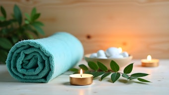
When thinking about color for your treatment rooms, be mindful of the size of your room. Is there any natural light in the room which could impact the depth perception of the colors being used? Choosing a calming color on the warmer side will make your space feel cozier. When the color gets too cool, your space can feel clinical or perhaps even cold, so balance the color story with a more grounding color.
Your Color Story
Depending on your preference and the kind of clientele you want to attract, you can appoint an energy that will vibe with your own color story.
A monochromatic color story is where you use a variety of a single hue. You could have brighter or darker shades, and this will create a look that is easy on the eyes. It creates a look of cohesiveness and can also make your space look larger by creating the illusion of openness.
When using a monochromatic color story, texture can be used to give your space more depth and interest. Often when people think of a monochromatic color theme, the word boring might come to mind. I would challenge you to think about what other colors you could use that would create a monochromatic theme that are not just cream or white.
Don’t be afraid to add a pop of color with a throw a pillow or even one feature wall for variety and grounding.
Another type of color story that can be used is a complementary color scheme. These are pleasing to the eye. Examples are red and green, yellow and purple or blue and orange in any variety of shades. They are called complementary colors because they pop next to each other. It’s normally a cool color with a warm colour that are directly opposite on the color wheel.
If you want to use three colors in your branding, choose three that are equally distanced apart on the color wheel. Examples can include green, purple and orange. When using this color scheme, have one of those colors as the dominant and the other two as accent colors.
The 60–30-10 Rule
Up to three colors can be used in your color story. When you follow the 60-30-10 rule, you can achieve a balanced, harmonious visual. The main color should make up 60% of the visible surface space. Apply the color on the largest area, generally walls. Then pick up the color in accent pieces and rugs.
The secondary color should make up 30% of the color story. This supports the main color, but is different enough to set it apart. Use this on accent walls, linens or drapes.
Your accent color should make up 10% of the color palette. Use this in the form of artwork, pillows or accessories.
Don’t Forget About Light
The types of lights that you install in your space will also impact the way the color shows up. If you are not thrilled with the way the color looks, change your light bulb before you go through the trouble to repaint your space. This simple fix can be the solution.
New Life
If you are feeling bored, tired or overwhelmed in your space, maybe a simple color shift could be the solution to a more peaceful and profitable spa.
Color is one of the most inexpensive, but incredibly powerful ways to create an “instant facelift” in your space. Simply buying new linens or adding a pillow or a small accessory can create a beautiful upgrade. Often, that pop of color can breathe a new fresh energy into your space that your clients will appreciate.
Tazeem Jamal is a spa biz coach, spa owner and master esthetician that has been in the industry over 30 years. She is a #1 Amazon bestselling co-author and has worked as an ambassador with TEDx. Jamal has been featured on TV, radio, podcasts and multiple Industry publications. For more, visit www.tazeemjamal.com.

