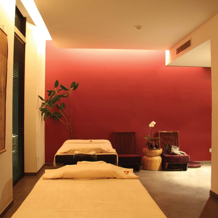
When combined with lighting, color is one of the most powerful elements of design. The colors you use in your spa space can have a profound effect on your clients and their physiological and emotional response to your business and the services and products you sell.
Before choosing color, consider your brand, your target market and the products you are selling. Ask yourself the following questions:
What’s my signature look?
Would I like to create an understated, elegant environment or a warm, casual environment?
Is my target market youthful women, middle-aged to older women, or women and men?
What colors comprise the packaging of my product lines?
What colors best highlight my products?
Once you know the answers to these questions, you can create an effective and powerful color palette for your interior.
Create a Color Palette
Every business should have a definitive color palette. It generally comes from the logo and branded marketing materials. These colors are often tweaked and expanded upon to create the appropriate color scheme for the business’ interior. Not every logo/brand color is appropriate on vertical walls or a ceiling. An interior color palette should have a dominant color, an accent color and two neutral colors. Once the palette is determined, additional shades of the dominant and accent colors can be added.
Color Placement
Placing the colors is of utmost importance. Here are some guidelines to help make smart decisions regarding color placement in your spa’s interior.
Dominant color. Use the dominant color on walls where you want a strong backdrop or to attract attention (i.e., behind the check-in/check-out counter(s), the wall behind your retail fixtures and the wall behind the waiting chairs). Wherever you want to make a statement, use the dominant color. It can also be used for one wall in each of the treatment rooms, generally the one opposite the door into the room.
Accent color. Use the accent color for trim, signage, fabrics and other decorative pieces (artwork).
Neutral colors. Use the neutral colors for the rest of the space. By neutral, I do not mean white. Creams, tans, beiges, greys and taupes are all great alternatives to white. White is generally just too stark and cold for most spa spaces.
The one exception is in medical treatment rooms, where white might be necessary for color matching to a client’s skin tone. Since there are many whites to choose from, pick one that leans warmer. Choose one that has more pink/red undertones versus a cooler white that has blue/grey undertones, as they will complement the subtle rose undertone of most skin types.
Taupes are often the preferred neutral because it is a combination of cool grey and warm brown, which means it coordinates well with a variety of accent colors. You don’t have to use a single neutral throughout the spa. Neutrals are often used in a “tone-on-tone” manner, meaning a darker version of the neutral is paired with the lighter version to create a subtle difference between departments, or walls in a room.
If you have a drywalled ceiling (as opposed to dropped acoustical ceiling tile), and you want the room to feel a bit larger, then use a light neutral. If you have a high exposed ceiling (with spiral ductwork and pendant lights), then a medium to darker neutral is preferred to help make the space feel a bit more intimate. I don’t suggest black on a ceiling, as it is just too dark and foreboding.
Warm Colors
Warm colors, such as reds, yellows and oranges, energize people.
Red is the most powerful of all colors, so use it carefully to avoid being too distracting. It has been shown to increase metabolism, appetite and grip strength. But it is also one of the most attention-getting colors on its own and communicates power, love and energy.
 Pink is actually a calm version of red. It makes skin tones look great, so a neutral color with a pink undertone is wonderful for dressing rooms and around mirrors where clients will be looking at themselves. Conversely, yellows and oranges make skin tones look bad, but are effective in small quantities to energize a space.
Cool Colors
Cool colors, such as blues and greens, are universally liked. They are comforting colors and help consumers slow down and relax. However, be careful with the shades of green you use in your space. Greens that have too much white or yellow are super bright and can cause high vibration in a room. Greens are also not flattering to skin tones.
Purple is a controversial color—some folks love it, others hate it. It is best used as an accent color and not a dominant color unless your brand focuses on purple. If so, use it wisely.
Color Pairing
Be careful when color pairing. It is a good rule of thumb to keep color saturations (perceived intensity of a color) similar in your color palette, so not too far apart, yet not too close together. For instance, light lavender and dark blue won’t work as well as a medium-dark purple and medium-light blue will because these latter two balance each other better. When working with complementary colors on the color wheel (i.e., blue and orange, purple and yellow, green and red), be sure to vary the saturations a bit to avoid an uncomfortable visual vibration if they are the same.
Light saturations, like pastel colors, generally don’t work well in a retail setting, as they tend to come off as weak and ineffective.
When you’re looking for a backdrop for your retail products to make them stand out, put a color that harmonizes with the products yet provides a visually supportive backdrop. For instance, if the products you carry are varied and multi-colored, then your dominant color, or a strong neutral, will probably serve well as a backdrop. If your product lines are simple in color—say all dark blue bottles with white labels—then a medium blue in the same color family as the dark blue would work, as would a medium green or medium red. And, of course, a medium-light neutral would work as well.
Lighting
Be aware of how your lighting affects the colors you choose. The difference between warm lighting and cool lighting can be dramatic when one reads a color in a space. Lamps with whiter light output (around 3,500-4,200 kelvin) and a color rendering index (CRI) of 85 or above will ensure your colors and customer look their best.
Trendy Colors
I’m often asked about the latest, trendy fashion colors, and if they are appropriate to bring into a spa interior. My answer is yes, but only when used to highlight a display of trendy merchandise, and for a short period of time (4 weeks to 3 months).
It also cannot clash with the spa’s color palette. Therefore, painting a wall that is used as a backdrop for a seasonal or holiday special, or a window display, can be fun and attention getting.
With any powerful tool, be careful how you use it. The right color combinations can strengthen your brand, keep your target market engaged, and showcase product lines.


